Understanding Memory Loss and the Power of Meaningful Care
Memory loss, or amnesia, can affect people of all ages. While occasional forgetfulness is a normal part of aging, more serious memory issues may stem from brain injuries, medical treatments, trauma, or conditions like dementia. Dementia, including Alzheimer’s and vascular dementia, can impact memory, judgment, and behavior—but it doesn’t define a person’s worth or abilities.
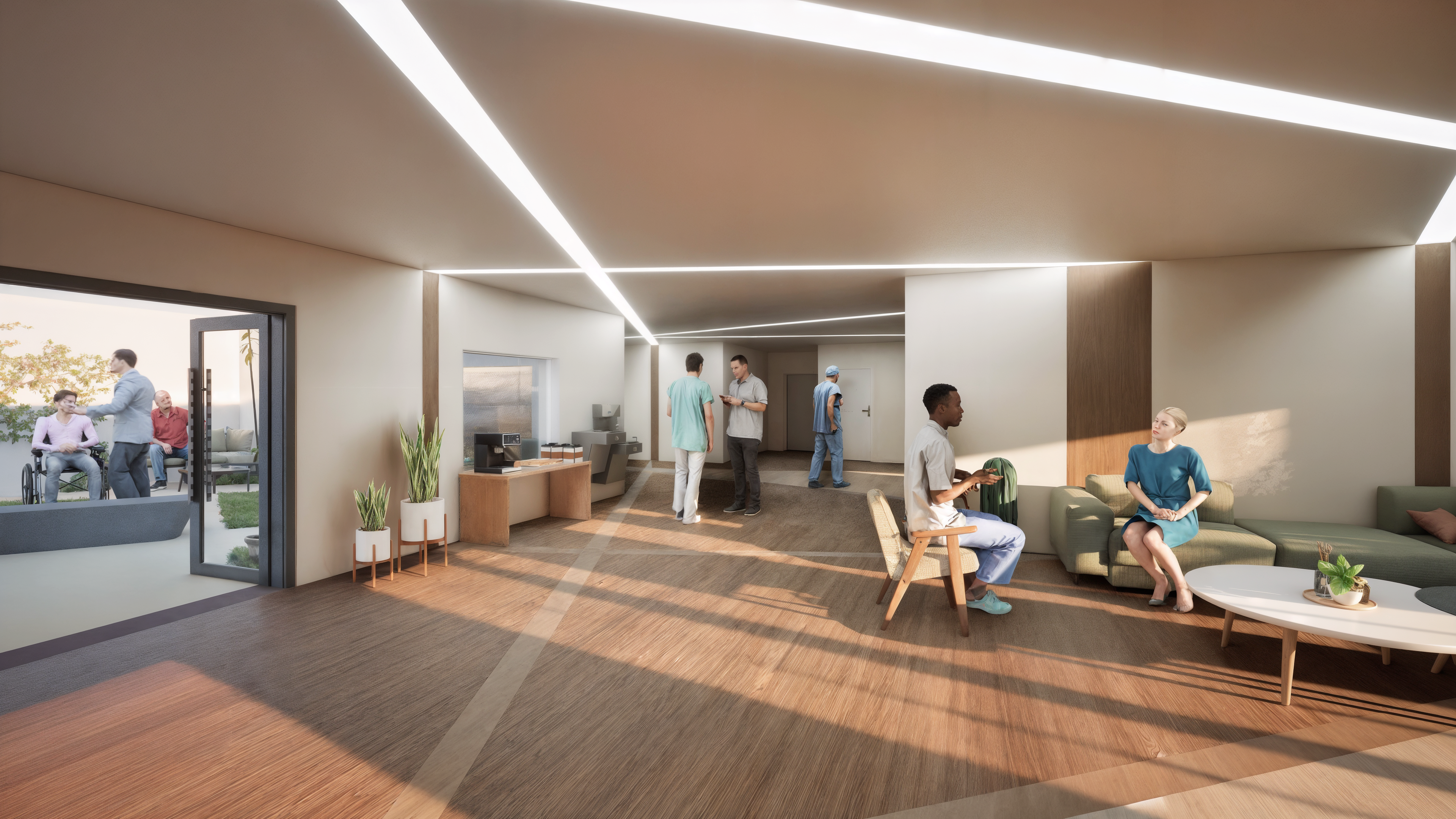
Supportive, familiar environments—staffed with compassionate caregivers—can help individuals with memory loss feel safe and empowered. This kind of care is not just for seniors; anyone experiencing memory challenges can benefit from thoughtful design and daily support that honors their dignity.
This project was inspired by Neil Aitken’s poem “Float,” which speaks to the unseen impact of moments, memories, and presence. It reminds us that even the smallest gestures can leave lasting impressions. Through intentional care and design, we can create spaces that truly connect, comfort, and uplift.
For this design, I was given a poem that explores themes of transition, memory, and the quiet fragments we leave behind. Inspired by its imagery—fractured light, torn leaves, and suspended moments—I created a 3D board to visually interpret the idea of incompleteness and connection. The board reflects how seemingly unrelated moments or remnants can intersect, how absence can speak as loudly as presence, and how the traces of our experiences—like bits of light or a sound lingering in silence—can subtly influence and shape everything around them. This piece is a meditation on what remains, and how those remains quietly shape our understanding of place, self, and time.
Assisted Living Facility Fllor PLan
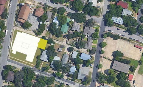
East 9th Street and Waller Street
East Austin, TX 78702
East 9th Street and Waller Street
East Austin, TX 78702

Float - by Neil Aitken 2016
— A fundamental type used to define numbers with fractional
parts
Like a bell, or rather the sound of it opening,
a silence that having tolled, speaks again,
Suspended between states of incompleteness—
a point traversing a numbered landscape.
This country of small infinities is what we do
with what remains: bits of window panes,
Refracted light, what gathers in the torn leaves
from the dimming edge of the red fields
grown dark. Say what you will, the body is no more
than the moon, a white trouser button in a pool

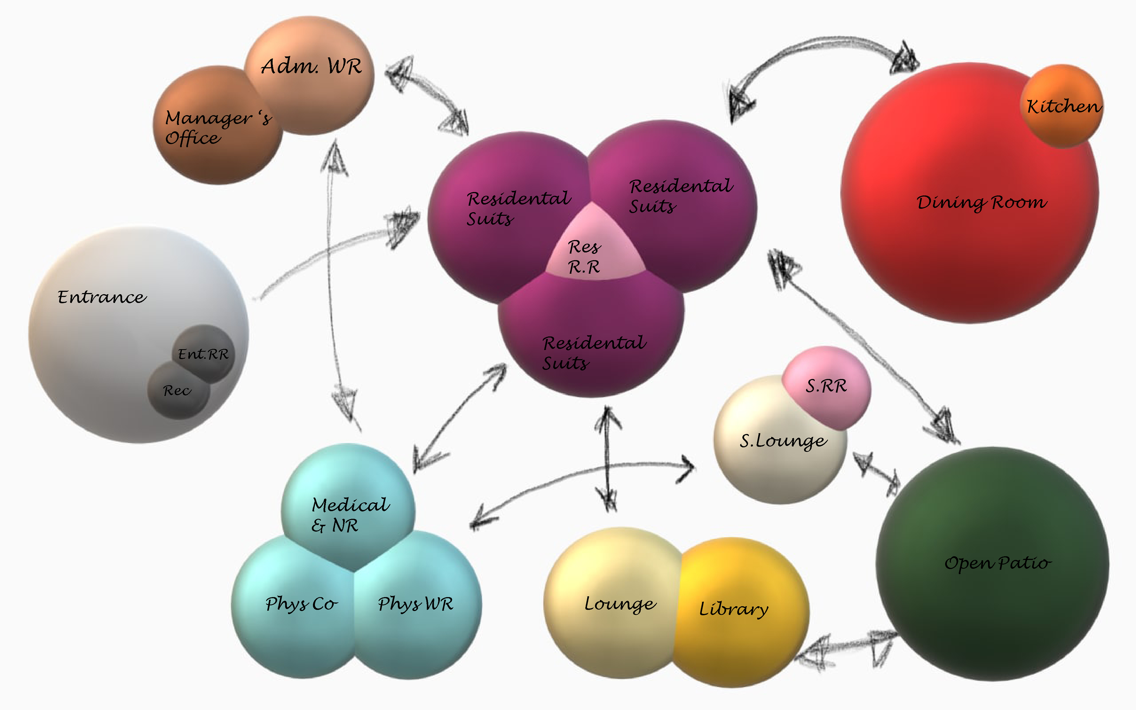
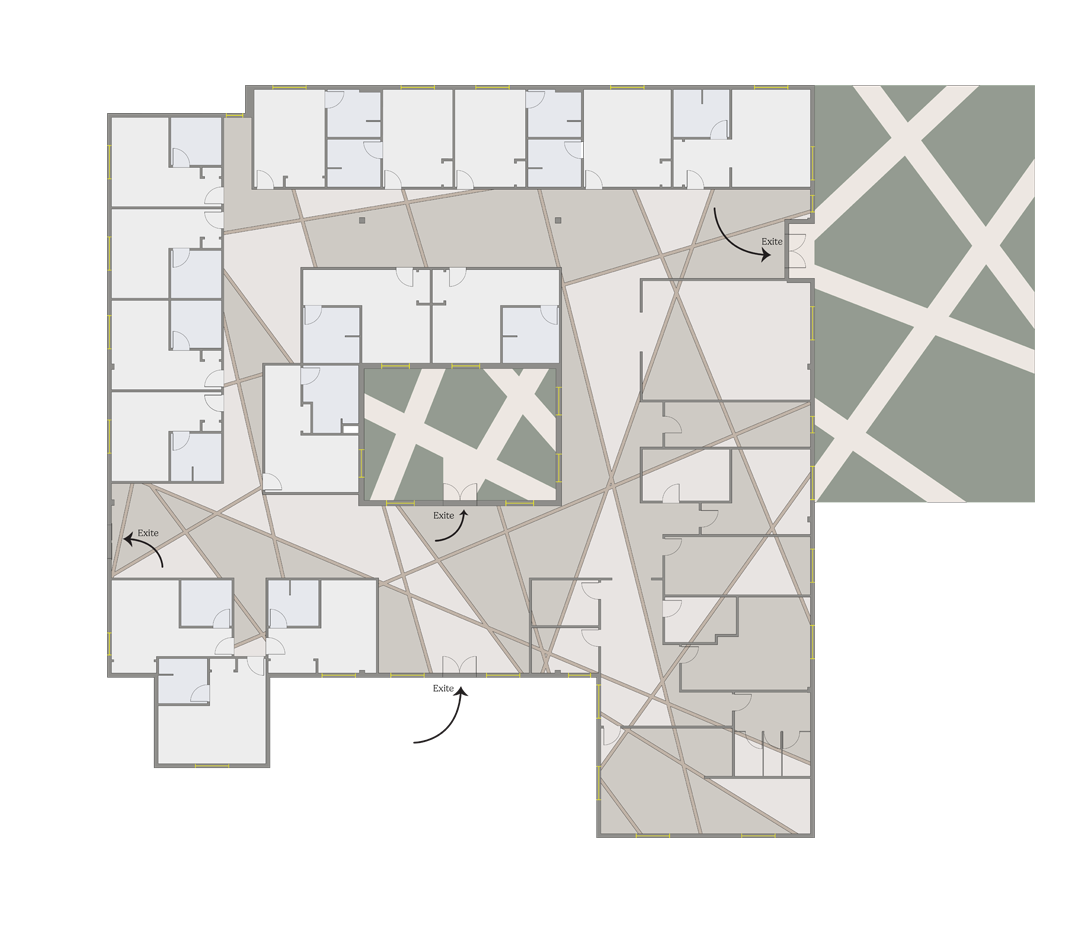
Using insights from the adjacency matrix and bubble diagram, I translated spatial relationships into the first draft of the layout, establishing a foundation for the overall design flow.

In this block diagram, I’ve located the residential units on the left side of the building to provide residents with a sense of privacy and separation from high-traffic areas. Common spaces—including the dining area, library, and lounge—are positioned on the right side, allowing for easy access while maintaining a peaceful living environment.
The Medical Center, located in the lower-right corner, houses the physician consultation rooms, nurse station, and medication area. This placement ensures that patients can meet with their healthcare providers in a more private and dedicated zone, slightly distanced from the social areas, yet still centrally connected to the overall layout.
Floor Plan
Floor Plan
Furniture Plan
Designing Direction: A Visual Language for Memory Support
In environments where memory loss affects daily life, even small design gestures can make a profound difference. For this project, I was inspired by a poem that reflects on how every moment—no matter how quiet or fragmented—carries meaning and consequence. That idea became the foundation of my design story.
I began by mapping spatial relationships through a line-based concept derived from my 3D model. These lines—seen across the floor plan—represent more than circulation paths; they are a visual language meant to gently guide residents who may struggle with memory or orientation.
Each line symbolizes a connection, a decision, a trace of movement—an intentional cue embedded into the environment. By integrating these lines into the flooring and overall layout, the design offers intuitive wayfinding, leading residents from their private units to shared areas like the dining room, lounge, and medical suite. Rather than rely on signage alone, the architecture itself becomes a tool for support and clarity.
This approach combines poetic inspiration with practical function, ensuring that residents feel grounded, independent, and safe within their surroundings. It’s a reminder that thoughtful design can speak softly—but carry deep impact.
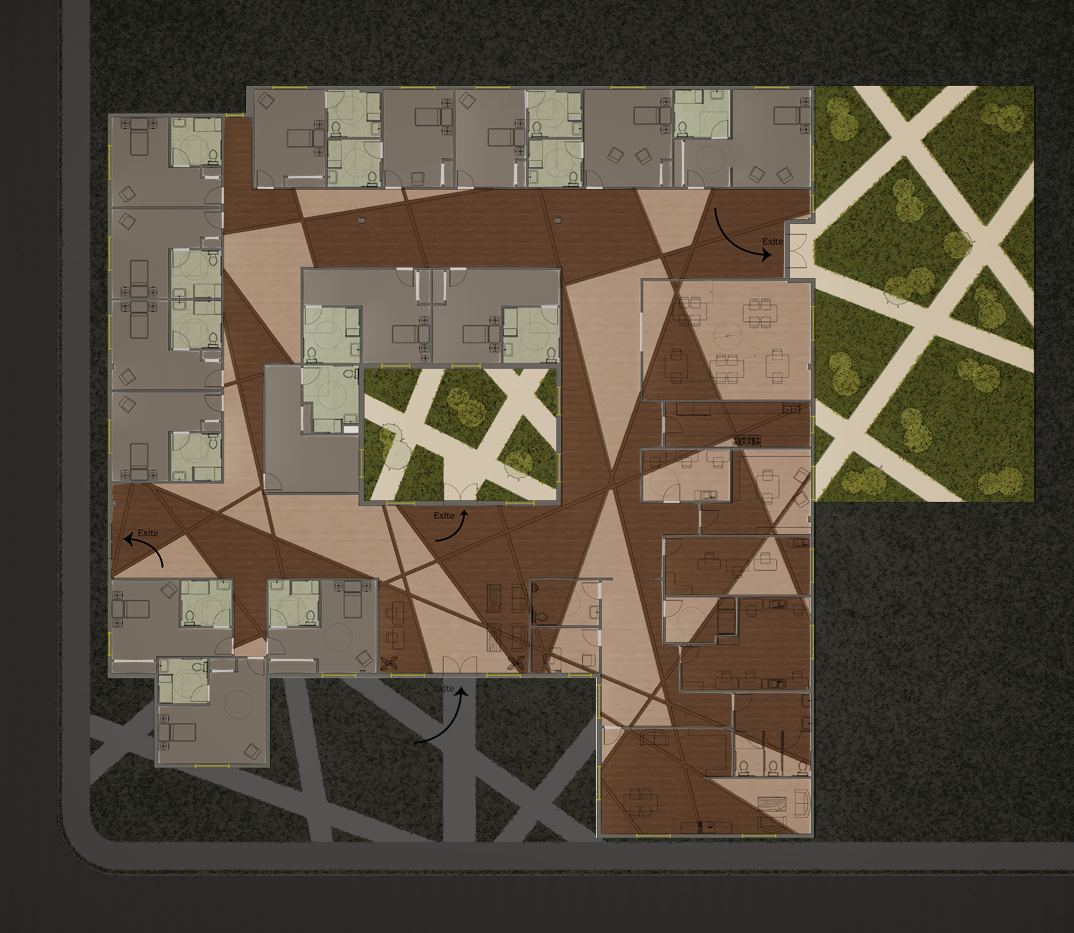
Reflected Ceiling Plan (RCP)

Purposeful Lighting for Memory Care
In this ceiling reflected plan (CRP), I integrated lighting, ceiling heights, and HVAC placement to enhance comfort and support wayfinding for Alzheimer’s patients.
The ceiling features three height zones (8’, 9’, and 10’) to define spaces and improve spatial clarity. Linear lights mirror the pathfinding lines on the floor, creating illuminated guides that help residents navigate the facility with ease.
An auto-dimming system adjusts brightness and color temperature throughout the day—cool, bright light during the day (up to 10,000 lux at 4,500–6,500K) and warm, dimmer light in the evening (300–500 lux at 2,700–3,500K). At night, amber lights provide subtle guidance without disrupting sleep patterns.
This approach combines aesthetics with functionality to create a calm, supportive environment tailored to memory care.


The linear recessed lighting selected for this project, best suited to our design and performance requirements, was sourced from Alcon Lighting.
To reinforce spatial hierarchy and guide user experience, I introduced changes in ceiling height and contrasting wood floor tones. These subtle architectural shifts help define each functional zone while maintaining visual continuity across the interior.
The geometry of the floor patterns is mirrored on the ceiling, creating a dynamic interplay between horizontal and overhead planes. At the points where these linear paths intersect, I used vertical wood panels on the walls to connect floor and ceiling—visually stitching the space together and creating a sense of rhythm and coherence.
Given the project's focus on memory care and Alzheimer’s patients, materiality was chosen with intention. Safety, ease of orientation, and a soothing atmosphere were top priorities. Engineered wood and wood-look vinyl were selected for their low-gloss, non-slip surfaces and soft, uniform tones—essential for reducing visual confusion and supporting gentle wayfinding.
The flooring palette was carefully curated:
- Light zones feature Premium European White Oak, 7-1/2" wide—a warm, open tone that promotes calm and clarity
- Darker areas are grounded with Imperia 7-1/2" Wide White Oak Engineered, adding contrast and spatial definition
- Linear inlays use Salerno 6-1/2" Wide planks, reinforcing directional cues and anchoring the design narrative
This layering of light, texture, and geometry creates a therapeutic yet contemporary environment, where form not only follows function—it enhances it.
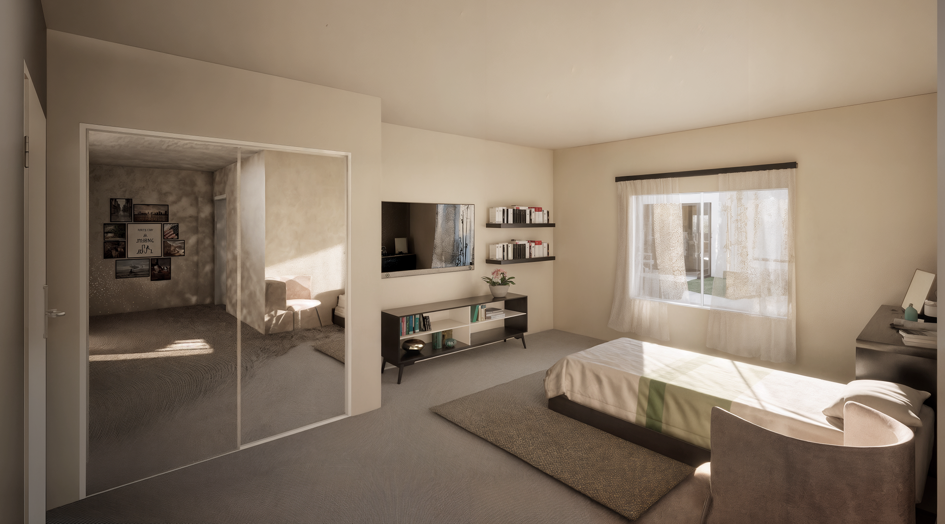
Accessible Elegance: Designing Calm Spaces for Memory Care
Each suite has been thoughtfully designed to align with accessibility requirements, ensuring comfort and ease of use for every individual. The majority of the furnishings are sourced from OFS, chosen not only for their quality but also for their adaptability to the client’s unique needs. Below, you’ll find the floor plan and elevation of one of the suites, reflecting a balance of functionality and refined design.
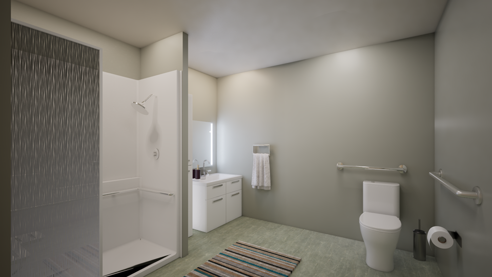
For the suite floor, I selected a woven carpet to minimize slipperiness while adding softness underfoot. This tactile comfort creates a sense of calm and reassurance, supporting clients’ overall well-being. The walls are finished in Warm Oats (Sherwin-Williams, Semi-Satin), a soothing neutral tone that balances light and warmth. Recognizing that memory-care clients may feel disoriented in overly complex spaces, I kept the rooms intentionally simple, reducing visual clutter and fostering clarity, comfort, and ease of navigation.
In the bathroom, I applied a green color scheme that balances both warm and cool tones. The psychology of color suggests green as a restorative choice, evoking harmony and relaxation—ideal for a space of daily care. Beyond aesthetics, the primary focus is accessibility. Every element, from clearances to fixture placement, has been carefully measured to meet accessibility requirements, all of which are detailed in the floor plans.
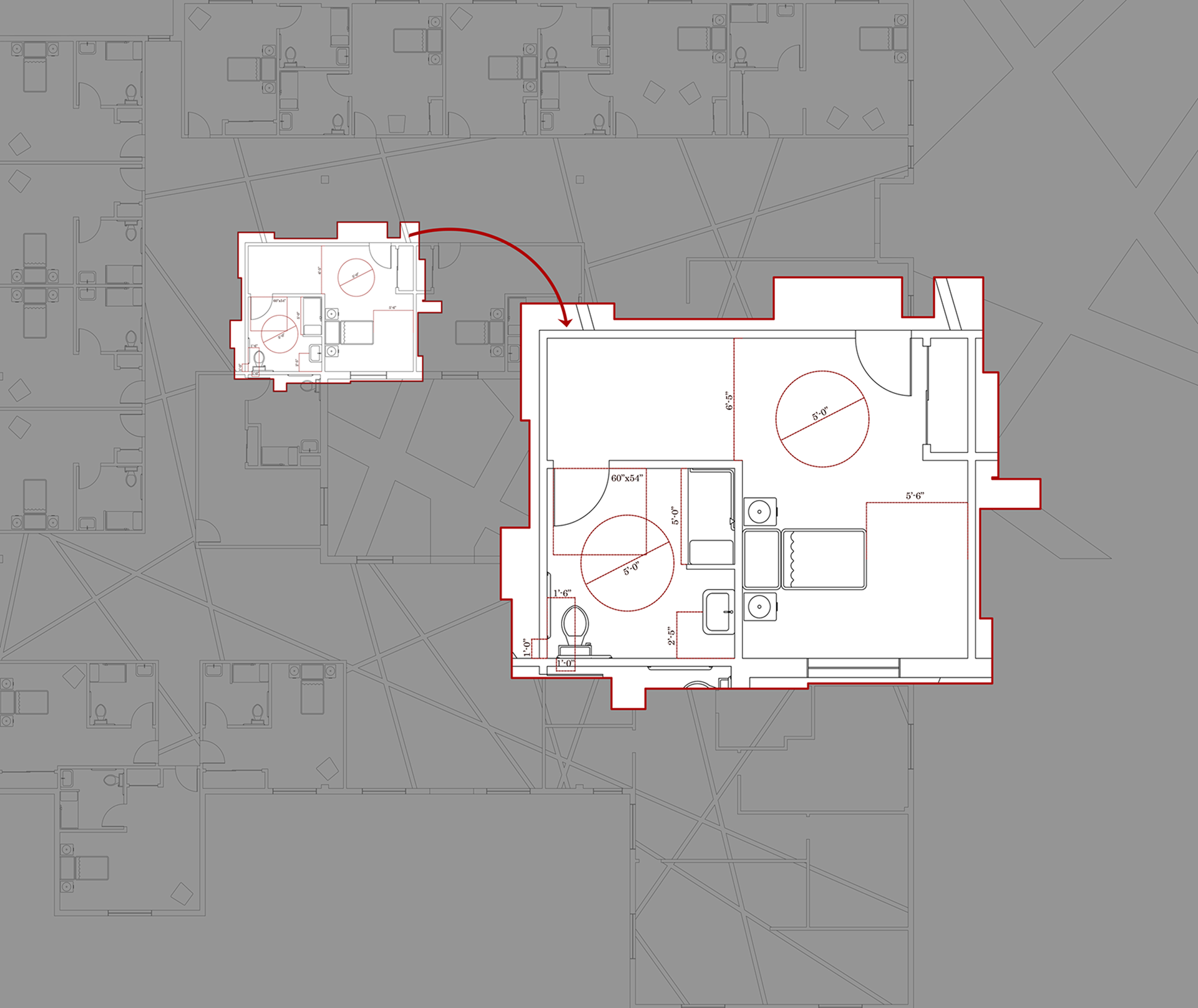
Room Floor Plan
Room